Tuesday 6 May 2014

Evaluation - END

Having finished my research and planning I was able to successfully create my teaser trailer, poster and magazine front cover. Having finished my teaser trailer I uploaded my teaser trailer to youtube to help promote the film even further.

This campaign has given me a taste on how it would be to develop a campaign of a real film, the things I have realised is the time and effort it takes to complete them and to find all the things needed in order to make the campaigns.

There were problems that occurred when it came to making my teaser trailer for example I needed to get people to East Finchley. It was quite hard to organise them all to be there as they were very busy doing their own work. Another problem that I couldn't do much about was the weather. On some days when I was planning to shoot, the weather was bad that I had to re-organise the shoot to another day which gave me a few problems, which I over came.

At the start of my project I made a brief post stating what I would try and achieve. I showed a poster, magazine front cover and a teaser trailer, all from one campaign. The thing I was trying to show with these media campaigns is that they all promote the same film and the audience can tell instantly.  

Production Brief 


Monday 5 May 2014

Evaluation - What Have I Learnt Through Audience Feedback? (Teaser Trailers)

Alongside getting feedback from magazines and posters, I feel that it is most important to get feedback from the teaser trailer is it is the most important campaign and I was intrigued to find out how my audience reacted towards it.

The questions I asked regarding the teaser trailer were:


  1. Does the teaser trailer use typical conventions?
  2. How effectively does the teaser establish genre?
  3. How effectively does the teaser trailer develop character?
  4. Is the narrative established?
  5. Would you be encouraged to find out more information about the film/ see film?


The feedback from my teaser trailer was really successful, more than the poster and magazine front cover. Some of the feedback I received was that they thought I gave them just the right amount of information about the film so that they would go see the film. They said with my first tagline 'Some Things Are Best Forgotten' this helped them realise that the two boys are older and the story has jumped to when they are older.

Finally with all the elements of my marketing campaign I asked my audience if they worked well together. They said that it was really easy to see that all pieces of media were promoting the same film and it was obvious what genre the film was. The small consistency with the font helped to tie the teaser trailer and poster together, and the central image on the magazine front cover is obvious as he appears in the teaser trailer.

Sunday 4 May 2014

Evaluation - What Have I Learnt Through Audience Feedback? (Magazine)

Again my choices were governed by the result of the conversation I had with each person as they would give me their feedback and giving me their opinion on things I should include or change, as I felt it was important to respond to my audiences desires and ideas, but at times I stuck to my conventions when it came to design choices.

For my magazine front cover the majority of them said that there should be an image of the killer and he should be looking serious which would show instantly what genre the film is.

The questions regarding my magazine front cover were:


  1. Would the magazine stand out on the shelf?
  2. Does magazine feel like a mainstream magazine?
  3. Does the magazine help promote the film?
  4. Can you tell magazine font cover is for a thriller film? 
  5. Does the magazines contain design/layout features you would expect to find in existing magazines? 


Again I got mainly positive responses from my audience which was helpful and nice to hear that all my research and planning was correct. Because I used a well known director for my film, and actors, it was very difficult to put stars on the cover of my magazine. My audiences feedback was almost very positive. The feedback that I received from my colour scheme was really positive as they liked the fact that it stood out and that the genre was obvious. They questioned who should appear on my magazine front cover as some people thought that the two main protagonists should have appeared.  However, I thought it was the correct decision to go with the image of the killer as he would be the one to show that the film is a conspiracy thriller.

Saturday 3 May 2014

Evaluation - What Have I Learnt Through Audience Feedback? (Posters)

Throughout my planning and research I constructed many focus groups, asking my friends, family and teachers to fill out the questionnaire to help me decide things like design, fonts and titles in order to find out peoples opinions in making it authentic and eye catching.

Focus Group - Fonts
Magazine Name
Taglines
Film Names

Often my choices were governed by the result of these conversation I had with each person as they would give me their feedback and opinions on things I should include or change, as I felt it was important to respond to my audience desires/ideas, but at times I stuck to my conventions when it came to designs choices - my poster was a good case in point because three quarters of people I asked felt that there should be a clear image of the main character at the heart of the picture, whereas I wanted to make the image of the killer as a silhouette which would make the poster look mysterious and would help make the film represent its genre.

This audience research was incredibly helpful when it came to shaping the direction of my marketing campaign.

The questions i asked regarding my poster were:


  1. Does the poster look authentic? 
  2. Does the poster give of the type of magazine it is? 
  3. Is the poster eye catching? 
  4. Can you tell which genre the film is from by looking at the poster? 
  5. Does the poster contain all the convention you would find in a typical poster?


I felt having black on the left and right with the white in the middle and the silhouette black would be perfect for my poster especially as my film is a thriller and a conspiracy. The main thing that my audience picked up instantly was the silhouette as the image because the majority of them know what the genre of the film was straight away. The colour scheme was really eye catching to the audience and I received lots of praise from them.  Also the font was picked up quite fast as they could tell my film was a conspiracy.


Friday 2 May 2014

Evaluation - Using Media Technologies In The Construction And Research, Planning And Evaluation 3

In this post I will focus on my making of my teaser trailer. whilst making my teaser trailer i had to think of a number of aspects in order to make my trailer look authentic and real, I need to take into account a number of things such as Mise-en-scene and the actual camera shooting for example making sure that there is enough head room ands that the camera is in the correct position. Most of the time when I was shooting I used a tripod to make sure that the camera is still, so there is not camera shake.

I had to make sure that the Mise-en-scene was correct, for example when I took a shot of one of the protagonists being tied up I needed to make there shot look real.


I took these images in order to show the audience how I tied one of my protagonists to a chair using ties. The second image you can see that the camera is really close to him as in my trailer we see his face not his whole body.


I took several pictures in order to choose what my establishing shot would be at the beginning of my teaser trailer. I took a few picture using my phone to help me choose what would be the best image for my trailer. I decided that i would use this image below:


The thing I also did, I got someone to sit on a chair and I set up the camera as I was getting the person in a close up which I took a picture of the screen if the camera to show how each close up should look like. 


I took this image below to think of where my detective could sit which I thought this would be perfect as the desk there were loads of papers on the desk which made the this shot look like there was lots of work being done. There was a problem with this desk because there were film posters all around it so when it came to shooting i had to get close up to the person so we wouldn't see the posters.


I decided that before I actually start recording for my teaser trailer, I wanted to go out to East Finchley and practice taking shots that would appear on my shot list. I used my phone to take these videos which I looked at them just before I recorded my trailer. 


This shot is of one of the protagonists when there older after the first tagline.


This is the shot of the killer where the protagonist see him and then he disappears.


This is the shot of the protagonists when he sees the killer.


When I was taking these videos I released that the want good because I was trying to create a double take which failed because the character ran before the bus past.


I tried to do this again, which I was able to achieve the double take successfully.


This is a shot of the person walking, like the killer does in my trailer.

Evaluation - Using Media Technologies In The Construction And Research, Planning And Evaluation 2

This time I want to focus mainly on the technologies that I used when making my poster and magazine front cover.

I used Photoshop elements which enabled me to write my texts, move them around, change their colours, make the colour of the background different and allowed me to include images and make silhouettes.


When I needed to produce something on photoshop, I needed to save each version in different formats, such as one as a photoshop version, which can be amended at a later time, and another as a JPEG version so that I could upload this to my blog.


Posters

Whilst making my poster I took a number of screenshots to state different effects, and tools that I used in order to make my final poster.


To make my poster I needed to merge my layers together so that if I wanted to move something they would all move together.  For example, I merged the stars names together so that they would be at the same distance and if I needed to move them they would all move together.


I also tried different colours for my background which by using the colour bucket and choosing the right colour which I had a loads of options to choose from. 


Magazines

Again I took several different screenshots to state the different effects I used to make my magazine front cover. 


Because I wanted to change the colour of the writing I clicked on the colour change tool which enabled me to chose a different colour.


I used the effect "Soft Edge" on the writing to allow me to make the writing change which enabled me to create the writing to the way I wanted it to look.


I used the gradient tool which enabled me to to make the background white and blue which I went from one corner to the other to make the colour gradient 


I highlighted my film name on my magazine front cover so that I could change the colour because I thought that yellow would be nicer and stand out to the audience. 


When I was making my cover lines I wanted each cover line to be the same size so I clicked on the layer of the first one and I duplicated it so that it would be the exact same.


When I finished making my magazine front cover I used a grid and ruler that allowed me to make sure that the spacing was exact so that my magazine would be perfect. 


I took a screenshot of the grid so I could show how it looks and how this helped me make my magazine perfect. 

Thursday 1 May 2014

Evaluation - Using Media Technologies In The Construction And Research, Planning And Evaluation 1

My entire campaign is presented in the form of a blog (Blogger). At the start of my coursework I needed to set up and create accounts for Blogger, Sound Cloud and Youtube. by doing so I was able to upload sound files, images and Video clips. My blog is full of research and planning that I did in order to fulfil my goals of creating a successful teaser trailer, poster and a magazine front cover for my film.


In order to add my teaser trailer I needed to put my trailer on youtube so that I could embed the link and copy it into HTML and then compose it to put it on my blog. Also by putting my teaser trailer on youtube helps promote the film.


Using a blog to show my research and planning has loads of advantages - not only is it easy to organise and manage tasks easily, but it is more enjoyable for the viewers to read and it is easier to support my research of examples of images, video clips, sound files and links. 

To Film My Teaser Trailer I used a digital camera (Panasonic HDC TM900) - it was easy to film this way with this camera as I could take numerous shots which could be erased if I was not happy with them. 


In order to edit my teaser trailer I needed to use the software called 'Avid'.  Using this I was able to separate all my shots into 'bins', onto the screen and also dragging them as I needed them on screen. 


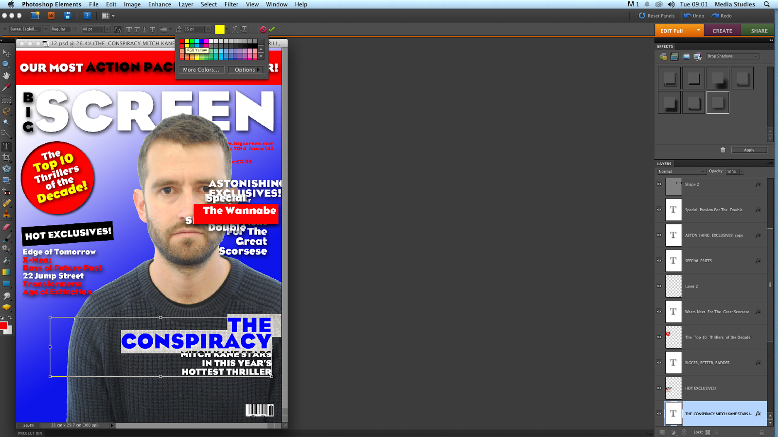
To create my taglines and billing, I used Adobe's photoshop - this allowed me to change colour, move around any images and word that I needed to be put in certain places to look authentic and real, I was able to crop images and sentences in order to make it the size or shape I wished it to be. 

I used tools I used:

'Magnetic Lasso' 

This enabled me to crop round an image easily, which was extremely useful when making my poster and magazine front cover. 

The 'Eye Dropper Tool' 


This enabled me to make colours from different things the same from one spot to another - and the ability to fill spaces with different colours.

'Hand Tool'

This tool was probably one of the most crucial tools that I used most as this enabled me to move things around so I could make the presentation correct and most importantly make my poster and magazine front cover look real.
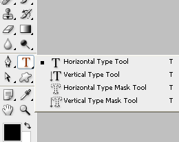
'Typing tool'


This tool enabled me to write things on my poster, magazine and even teaser trailers with the billing, taglines.

Once these images were made and saved, I then dragged them into Avid and used special effects that appear on screen with sound effects - these were taken from the BBC Sound Effects Library. 

This is part of the Tool bar on Adobe's Photoshop


Another thing that I used photoshop for in my teaser trailer was at the end of the trailer when the name 'The Conspiracy' comes up.  I made each letter come up separately, like a typewriter, which gave the film a conspiracy look. In able to achieve this I needed to use Photoshop. I used each letter and saved each letter I added which I then put sound effects off a computer read out.


Using the bins made my editing much easier and it was really beneficial to recognise the right shot because I organised them in to scenes. Each shot was carefully labeled into sections regrading each scene - making the process run much smoother making fewer mistakes and spending lots of time looking for each shot and because I had lots of shots that gave me a bigger option. I took the shots which matched my storyboard and running order. My Storyboard really helped me when taking my shots because I new what shot I needed to do.  Therefore all the research and planning I did helped me shoot each shot much faster. The multi track feature allowed me to layer all my shots with their effects and music - then carefully editing them together. 

Here are some of my screenshots of certain elements of the Avid editing software, the first being a bin of my shots, second being my layering, tracks and my bin selection. 


When I edited my trailer there were two square at the top, the one on the left was the shot I was including and the one on the right was the actual trailer and what I had so far.


This image is what Avid looks like when all of my bins are selected, you can see all the elements of editing software.