
Sunday, 20 April 2014

Friday, 18 April 2014
Wednesday, 16 April 2014
Research and Planning - Magazines
The image below are the save versions of me including the writing on the magazine using Photoshop, all I thought at this stage was what I wanted to include on my poster and also I made sure that the font of the writing was right.


having been writing on the magazine I know played around on photoshop with colours which I made the banners red because I firstly thought because my film is a thriller and also my magazine is a big budgeted magazine I thought the brightness helped show the style of magazine. I also used the gradient tool to make there a blue and white background.


At this stage I thought the name of my film should appear in yellow as it stands out and looks good with blue background and the red banners.


Having played around with the background I the white should be on the bottom right corner instead at the top left corner so using the gradient tool I when the other way to make the blue and white chasing direction which made my poster look more authentic.


This is my final magazine front cover:

Monday, 14 April 2014
Research and planning - Poster
Whilst I was editing my poster using Photoshop I saved a copy at various stages to state the different stages that I went through whilst making my poster. At the beginning was just putting all the writing that appears on the poster and then goes to the image and colour scheme.
The images below was at the beginning when I was editing my poster all I did was i put all the writing that I wanted to appear on my poster. I included my film name, name of actors, tagline studios and billing.


Having done some of the writing I started to play with the colour of the background to try and find what colour would be most suitable and look the best for Poster as my film is a thriller. Which I realised that they were not the right colours for my poster so i went back to the black background.




The images below was at the beginning when I was editing my poster all I did was i put all the writing that I wanted to appear on my poster. I included my film name, name of actors, tagline studios and billing.
Having done some of the writing I started to play with the colour of the background to try and find what colour would be most suitable and look the best for Poster as my film is a thriller. Which I realised that they were not the right colours for my poster so i went back to the black background.
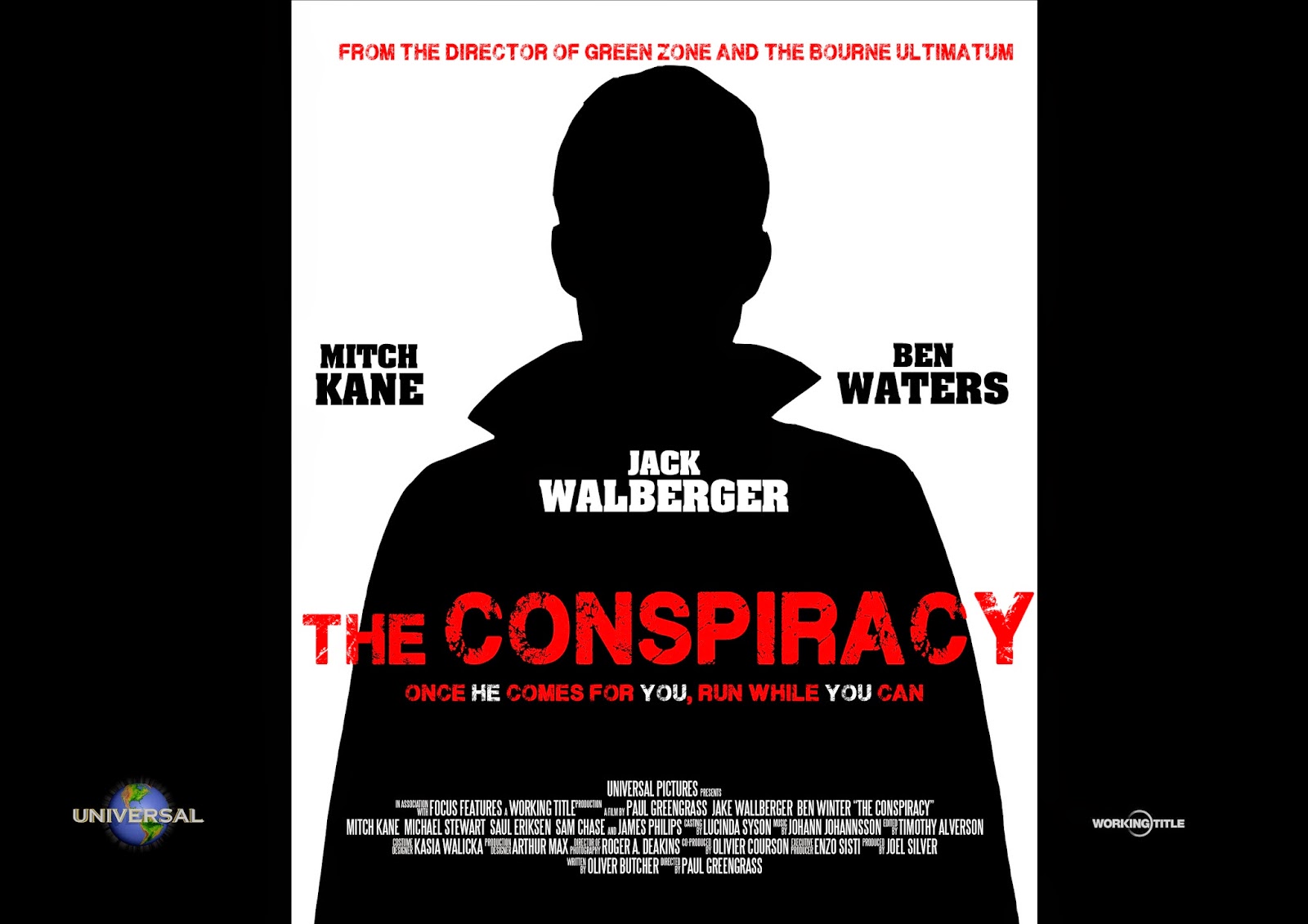
Having ton beck to the black background I decided instead of putting a picture of the killer on my poster I wanted the killer to appear in a silhouette which make mystery and fits the genre perfectly and especially because my film is a conspiracy and the silhouette helps demonstrate the conspiracy. I chose the have black on both sides and in the centre I had white which the makes the body standout.
I then thought that I needed to put something on both sides of the poster so it doesn't look really empty so I decided to put reviews on my poster which would help promote the film however because my film is a big budgeted film the reviews are not so important as if my film was an independent film.
This is my final poster:
Sunday, 13 April 2014
Storyboard
Now that I have finished my final shot list and running order, I have created a storyboard to help me ahead of filming


Subscribe to:
Posts (Atom)