The images below was at the beginning when I was editing my poster all I did was i put all the writing that I wanted to appear on my poster. I included my film name, name of actors, tagline studios and billing.


Having done some of the writing I started to play with the colour of the background to try and find what colour would be most suitable and look the best for Poster as my film is a thriller. Which I realised that they were not the right colours for my poster so i went back to the black background.


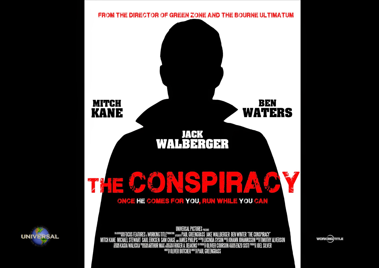
Having ton beck to the black background I decided instead of putting a picture of the killer on my poster I wanted the killer to appear in a silhouette which make mystery and fits the genre perfectly and especially because my film is a conspiracy and the silhouette helps demonstrate the conspiracy. I chose the have black on both sides and in the centre I had white which the makes the body standout.


I then thought that I needed to put something on both sides of the poster so it doesn't look really empty so I decided to put reviews on my poster which would help promote the film however because my film is a big budgeted film the reviews are not so important as if my film was an independent film.
This is my final poster:

No comments:
Post a Comment